
There often may be a low cost in measuring a great number of variables, but this creates a challenge in creating information from the data. This is where ordination comes in.
Overview
This page provides a very brief overview of some useful ordination techniques like Principle Components Analysis (PCA), Discriminant Function Analysis (DFA), and related techniques. A challege with such multivariate analyses is that different applied fields seem to have adopted different notation and jargopn associated with the basic techniques. Here we will adhere to common terminology used amongst biologists, with no emphasis on equations and instead focus on practical use and R code. Like many worthwhile things, if you want to get serious it will require more study and for this I have provided a number of good references at the end.
Contents
10.1 Principle Components Analysis
10.2 Discriminant Function Analysis
This page provides a brief overview on two methods to defend your sample size. First, methods in data and sample size simulation are examined. Then, we will look at tools for calculating power and sample size.
10.1 Principle Components Analysis
Principal Components Analysis (PCA) finds the greatest variation in a dataset consisting of some number of variables (from 2 up to many!) and extracts this axis of greatest variation as the first “principal component”. The next most variable direction that is uncorrelated with (“orthogonal to”) the first is the second principal component, and so on. The procedure itself does not alter distances between pairs of points. However, these distances ARE altered somewhat if only the first few principal components are retained and the later ones are discarded.
Typical cases for use of PCA would be:
-
Data reduction - use PCA to convert a large number of variables to just a few principle components that capture most of the information
-
Data summary - visualize the measurement space based on a few principle components
The biplot
A biplot produces a scatter plot of the data along principal component axes, and adds arrows to indicate the contributions of each trait to these principal components. The biplot() function in base R accomplishes this, and there is also a ggbiplot() function. Another nifty package for PCA is {factoextra}, which we can look at.
# Boilerplate code

# Setup code for ggbiplot()

install.packages("devtools", dependencies=TRUE, type="binary")
library(devtools)

install_github("vqv/ggbiplot")
library(ggbiplot)

# If you like your ggplot() graphs classic
theme_set(theme_classic())

# {factoextra}
install_github("kassambara/factoextra")
library(factoextra)
Preparing data and variables
PCA analysis will only reliably yield sensible results if all the variables are on a reasonably similar scale. This can usually be accomplished with a log() transformation when the data are morphological traits measured in similar units. For example, if the traits are a mixture of linear measurements, surface area, volume, or mass measurements, then after taking logs it may be advisable to divide surface area measurements by 2 and volume or mass measurements by 3, etc. (equivalent to taking the square and cube roots before log-transforming). This part of PCA analysis is subjective and requires practice to become confident.
Example data
For convenience, we will use a stock dataset on olympic decathlon performance that is included in {factoextra}, called decathlon2. NB the data frame has 13 variable columns (the first 10 are performance vars for each decathlon event) and 27 rows, each corresponding to an athlete.
# Boilerplate code

data(decathlon2)
head(decathlon2)
> head(decathlon2)
          X100m Long.jump Shot.put High.jump X400m X110m.hurdle Discus Pole.vault
SEBRLE    11.04      7.58    14.83      2.07 49.81        14.69  43.75       5.02
CLAY      10.76      7.40    14.26      1.86 49.37        14.05  50.72       4.92
BERNARD   11.02      7.23    14.25      1.92 48.93        14.99  40.87       5.32
YURKOV    11.34      7.09    15.19      2.10 50.42        15.31  46.26       4.72
ZSIVOCZKY 11.13      7.30    13.48      2.01 48.62        14.17  45.67       4.42
McMULLEN  10.83      7.31    13.76      2.13 49.91        14.38  44.41       4.42
          Javeline X1500m Rank Points Competition
SEBRLE       63.19  291.7    1   8217    Decastar
CLAY         60.15  301.5    2   8122    Decastar
BERNARD      62.77  280.1    4   8067    Decastar
YURKOV       63.44  276.4    5   8036    Decastar
ZSIVOCZKY    55.37  268.0    7   8004    Decastar
McMULLEN     56.37  285.1    8   7995    Decastar
If the traits are on a comparable scale, then they are expected to have relatively similar variances. Of course the variances will not be exactly the same, but e.g., they should have the same order of magnitude. You can check this by exploring the data as follows.
# Boilerplate code

# mydata is a data frame of numeric variables only
# the covariance matrix v is

v <- cov(mydata)  # the covariance matrix -- variances are along the diagonal
v <- var(mydata)  # this works too
diag(v)           # extracts the diagonal, i.e., the variances.
# Decathlon

v <- cov(decathlon2[,1:10])
round(diag(v), 3)
# Variances are not on same scale!

> round(diag(v), 3)
       X100m    Long.jump     Shot.put    High.jump        X400m X110m.hurdle
       0.079        0.087        0.700        0.009        0.955        0.221
      Discus   Pole.vault     Javeline       X1500m
      11.799        0.068       27.365      104.158
You can still do a PCA even if the variables cannot be put on the same scale (e.g., because they are in such different units). In this case you’ll want to have all the traits standardized to have a variance of 1 before analyzing by indicating that you want to use the correlation matrix instead of the covariance matrix when carrying out the PCA.
Missing data
If your data include missing values, create a new data frame that eliminates all rows containing missing values. This will make it easier later when you want to save the principal component axes and have them correspond to the data used to calculate them.
Basic rules:
-
if you have some columns that are missing all or most rows, remove them
-
if you have a very large number of missing values, you might consider a different method
# Boilerplate code

# Remove NAs
mydata <- na.omit(myoriginaldata)
Performing the PCA
There are several methods in R to accomplish PCA. Here we will use the prcomp() function.
# Boilerplate code

z <- prcomp( ~ x1 + x2 + x3, data = mydata) # formula method
z <- prcomp(mydata[ ,1:3])                  # shortcut, indicating columns
If you need to have the variables standardized before analysis (use the correlation matrix instead of the covariance matrix), use the scale = TRUE option. NB this can help visualize and “separate” the variables, but may impose a small cost in interpretation.
# Boilerplate code

# Scale the variables to impose a common scale
z <- prcomp(mydata, scale = TRUE)
# Decathlon example
z <- prcomp(decathlon2[,1:10], scale = TRUE)
Visualising PCA with a biplot
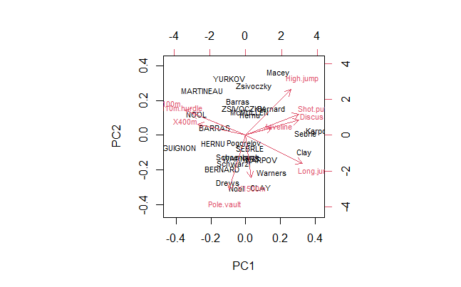
The biplot() function in base R makes a scatter plot of the data points along a pair of principal components (the first and second components, by default) and overlays arrows to indicate the contributions of each trait to the principal components. The graphs can get messy if there are too many variables. Use the cex argument as well as xlim and ylim to help fit the labels onto the graph.
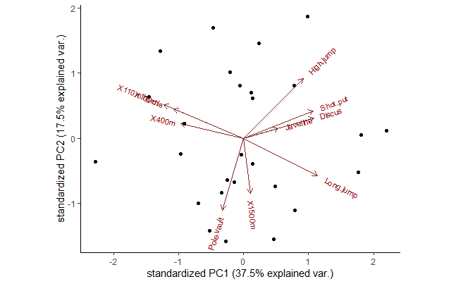
You can also use ggbiplot() if you have installed and loaded it (see instructions above). This function will color code groups automatically (if you have a grouping variable in the data set) and will also draw ellipses around points in each group. Note that this is for visuals only — principal components analysis by itself pays no attention to group membership.
# Boilerplate code

# Pick PCs with choices argument
biplot(z, choices = c(1,2), cex = 0.7) # PC1, PC2
biplot(z, choices = c(3,4), cex = 0.7) # PC3, PC4

# Fancier biplot
ggbiplot(z, choices = c(1,2))
ggbiplot(z, ellipse = TRUE, choices = c(2,3), groups = mydata$groupvar)


# Even fancier from {factominer} functions

# Graph of individuals
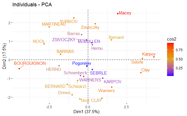
fviz_pca_ind(z,
             col.ind = "cos2", # Color by the quality of representation
             gradient.cols = c("blue", "goldenrod", "red"),
             repel = TRUE     # Avoid text overlapping
             )

# Graph of variables
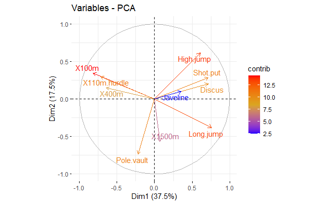
fviz_pca_var(z,
             col.var = "contrib", # Color by contributions to the PC
             gradient.cols = c("blue", "goldenrod", "red"),
             repel = TRUE     # Avoid text overlapping
             )

# Regular biplot
fviz_pca_biplot(z, repel = TRUE,
                col.var = "blue", # Variables color
                col.ind = "gray50"  # Individuals color
                )
# Graph of individuals in Base R

biplot(z, choices = c(1,2), cex = 0.7) # PC1, PC2
# Fancier biplot for Decathlon PC1 and PC2
ggbiplot(z, choices = c(1,2), cex = 0.7) # Better
# Graph of individuals
fviz_pca_ind(z,
             col.ind = "cos2", # Color by the quality of representation
             gradient.cols = c("blue", "goldenrod", "red"),
             repel = TRUE     # Avoid text overlapping
             )
# Graph of variables
fviz_pca_var(z,
             col.var = "contrib", # Color by contributions to the PC
             gradient.cols = c("blue", "goldenrod", "red"),
             repel = TRUE     # Avoid text overlapping
             )
# Regular biplot
fviz_pca_biplot(z, repel = TRUE,
                col.var = "blue", # Variables color
                col.ind = "gray50"  # Individuals color
                )
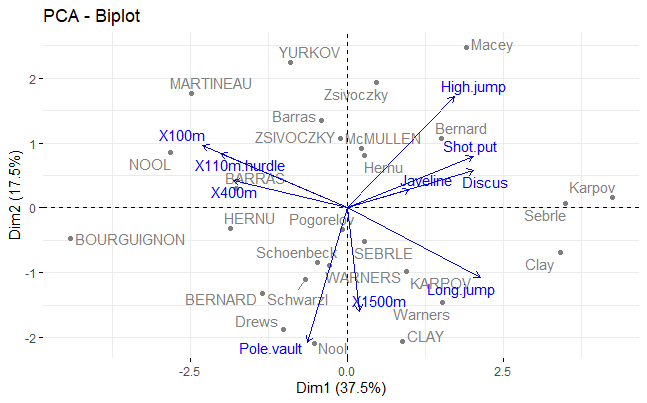
Screeplot and eigenvectors (loadings)
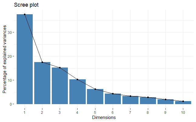
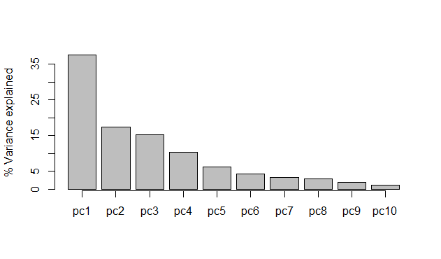
Use the following commands to extract results from the prcomp object (here called z). If you included k variables in the analysis, then there will be exactly k principal components.
# Boilerplate code

print(z)                      # summarize results

screeplot(z, type="lines")    # "scree" plot of eigenvalues
screeplot(z, type="barplot")  # same, but using bars

z$rotation[, 1:5]             # eigenvectors (loadings) for first 5 components
z$sdev^2                      # eigenvalues (variances)
# Decathlon screeplot with factominer
fviz_eig(z)
# DIY screeplot in Base R
(x <- barplot(z$sdev^2/sum(z$sdev^2)*100,
             ylab = "% Variance explained"))

axis(side = 1, at = x,
      labels = c("pc1", "pc2", "pc3", "pc4", "pc5",
                 "pc6", "pc7", "pc8", "pc9", "pc10"))
# Eigenvectors (variable loadings), 1st 4 PCs
round(z$rotation[, 1:4], 2)
               PC1   PC2   PC3   PC4
X100m        -0.42  0.26 -0.08  0.10
Long.jump     0.39 -0.29  0.01 -0.18
Shot.put      0.37  0.21 -0.38  0.04
High.jump     0.31  0.46  0.00  0.07
X400m        -0.33  0.11 -0.42  0.27
X110m.hurdle -0.37  0.23 -0.34 -0.16
Discus        0.37  0.15 -0.22  0.39
Pole.vault   -0.11 -0.56 -0.33 -0.25
Javeline      0.18  0.07 -0.56 -0.48
X1500m        0.04 -0.43 -0.29  0.64
# Are the variances way out of scale?
# eigenvalues (variances)
par(mar=c(5,8,4,2))
barplot(z$sdev^2, horiz = T, las = 2,
        names = colnames(decathlon2[,1:10]),
        xlab = "variance")
par(mar=c(5,4,4,2)+1) #put back defaults
Accessing individual variable scores for further analysis or visualisation
Use predict() to extract the principal component scores, the measurements of every individual on the principal component axes. Note that this function will yield a matrix object.
# Get the individual PC scores

x <- predict(z)                                  # Scores for pc1, pc2, ...
x <- as.data.frame(x, stringsAsFactors = FALSE)  # Converts matrix object to data frame

head(x[,1:4]) # individual PC scores for PC1 through PC4
                 PC1        PC2        PC3         PC4
SEBRLE     0.2727622 -0.5264068 -1.5556058  0.10384438
CLAY       0.8879389 -2.0551314 -0.8249697  1.81612193
BERNARD   -1.3466138 -1.3229149 -0.9439501 -1.46516144
YURKOV    -0.9108536  2.2390912 -1.9063730  0.09501304
ZSIVOCZKY -0.1018764  1.0694498  2.0596722  0.07056229
McMULLEN   0.2353742  0.9215376  0.8028425  1.17942532
...
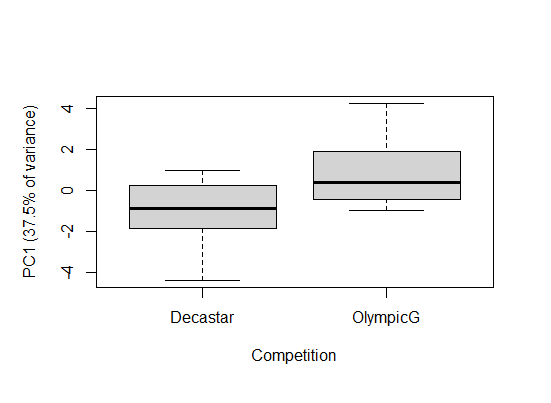
Say you wanted to ask whether there was a difference in the 2 categories of athletes in this dataset, e.g. to ask if there is a difference in performance for them. The variable Competition categorizes winners of either a decathlon olymic gold medal, or a Decastar competion. Here, we can use the PC scores in an analysis. In our decathlon2 dataset, PC1 represents 37.5% of variation for all 10 competitions.
# Do scores differ amongst the categories

boxplot(x$PC1 ~ decathlon2$Competition,
        ylab = "PC1 (37.5% of variance)",
        xlab = "Competition")
t.test(x$PC1 ~ decathlon2$Competition)
	Welch Two Sample t-test

data:  x$PC1 by decathlon2$Competition
t = -3.1608, df = 24.998, p-value = 0.00409
alternative hypothesis: true difference in means is not equal to 0
95 percent confidence interval:
 -3.3485350 -0.7063902
sample estimates:
mean in group Decastar mean in group OlympicG
            -1.0512769              0.9761857
There is a significant different is PC1 between winners in the Decastar and OlympicG categories (t-test: t = -3.16, df = 25.0, P < 0.005).
10.2 Discriminant Function Analysis
Linear Discriminant Function Analysis (DFA) is used to find axes (linear combinations of variables) that best separate predefined groups. The axes maximize variation between groups relative to variation within groups. In contrast, Principal Components Analysis pays no attention to groupings in the data and finds axes that maximize total variation.
DFA is also used to classify individuals into groups. Often this is carried out by dividing the data randomly into halves. The discriminant analysis is carried out on the first half, referred to as the “training” data set. The discriminant function is then used to classify individuals in the second half of the data into groups. Compare the resulting classification with the original groupings gives an idea of the misclassification rate.
The necessary functions are in the {MASS} package.
library(MASS)
The method expects a grouping variable (i.e., a factor) and one or more numerical variables to be used in calculating the discriminant function. For example, mydata is a data frame having a grouping variable named group and 3 numerical variables x1, x2, and x3.
# Boilerplate

# The following lines are equivalent
z <- lda(group ~ x1 + x2 + x3, data = mydata)  # formula method
z <- lda(group ~., data = mydata)              # shortcut
By default, the method will use the frequencies in each group as the prior probabilities for classification. To change the default, provide a vector of prior probabilities ordered in exactly the same way as the group factor levels. For example, if the grouping factor has three levels, the following command will specify equal prior probabilities.
z <- lda(group ~ x1 + x2 + x3, data = mydata, prior = c(1/3, 1/3, 1/3)) Results are extracted from the lda object (here called z). If there are k groups in the analysis, then there should be k - 1 discriminant axes.
plot(z) # scatter plot of new discriminant functions print(z) # trait loadings and other statistics z$scaling # trait loadings Use predict to obtain the discriminant function scores, the measurements of every individual on the discriminant function axes. The results are in matrix format rather than in a data frame. (See the “Data” page at the R tips web site for help with matrices.)
predict(z)$x # yields the individual values (scores) for df1, df2,…
Classification The predict command can also be used for classification. For example, assume that the same variables have been measured on a separate set of individuals in the data frame newdata. The following command will classify the new set according to the discriminant function,
z1 <- predict(z, newdata) If left unspecified, the prior probabilities will be the same as those used in the preceding lda command. See above for information on how to specify a different prior. The results of the classification are stored as separate items in a list (here named z1). The groups are stored as a factor. The posterior probabilities and predicted scores are matrices.
z1$class # The groups into which the newdata were classified z1$posterior # posterior probabilities of group classifications z1$x # yields scores of df1, df2,… for newdata If the newdata are not provided then predict will classify the individuals in the original training data set instead. The misclassification rate is expected to be on the low side when the data to be classified are the same as the data used to generate the discriminant function.
z1 <- predict(z) table(mydata$group, z1$class) # accuracy of classification
10.3 Correspondence Analysis
10.4 Multidimensional Scaling
10.5 Suggested resources
PCA
Hotelling, H., 1933. Analysis of a complex of statistical variables into principal components. Journal of Educational Psychology 24, 417–441. https://doi.org/10.1037/h0071325
Novembre, J., Johnson, T., Bryc, K., Kutalik, Z., Boyko, A.R., Auton, A., Indap, A., King, K.S., Bergmann, S., Nelson, M.R., Stephens, M., Bustamante, C.D., 2008. Genes mirror geography within Europe. Nature 456, 98–101. https://doi.org/10.1038/nature07331
Novembre, J., Stephens, M., 2008. Interpreting principal component analyses of spatial population genetic variation. Nature Genetics 40, 646–649. https://doi.org/10.1038/ng.139
Pearson, K., 1901. LIII. On lines and planes of closest fit to systems of points in space. The London, Edinburgh, and Dublin Philosophical Magazine and Journal of Science 2, 559–572. https://doi.org/10.1080/14786440109462720
Good PCA video with very little math