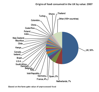
 Critique bad graphs as a sport
Graphing and tables as outputs
Overview
The finest data analysis can easily be wrecked by bad graphs
This page introduces the basics of practice, and good practice, in producing graphs and tables in R. In the examples below, x and y are numeric variables in the hypothetical data frame, mydata. A and B are categorical variables (factors or character variables) identifying different groups. We will simulate some data as we need it to illustrate examples, but the idea is use these examples to adapt to your own data.
We include examples making use of the add-on packages {dplyr} and {ggplot2}. Hadley Wickham’s book is the standard reference (Wickam, H. 2016. ggplot2: Elegant graphics for data analysis. 2nd edition) but plenty of introductory resources for {ggplot2} are available online (e.g., this ggplot tutorial at r-statistics.co).
You can set up your session to run the theme_set(theme_classic()) command at the start of your session to replace ggplot2’s default theme, which has a lot of chartjunk. Or, add the theme by using + theme_classic() to your ggplot() command. Other simple themes include theme_minimal() and theme_bw().
library(dplyr)
library(ggplot2)
theme_set(theme_classic())
Contents
3.2 Tables of descriptive statistics
3.4 Frequency distribution of a variable
3.5 Association between variables
3.6 Using the {lattice} package
These commands generate tables of frequencies.
One categorical variable
This frequency table counts the number (frequency) of cases in each category of a categorical variable A. Using the useNA argument add the category NA if one or more cases is missing.
table(mydata$A, useNA = "ifany")

# or

with(mydata, table(A), useNA = "ifany")
The summarize command in dplyr package can generate frequency tables with its n() function.
summarize(group_by(mydata, A), Frequency = n())
Two variables (contingency table)
The following commands generate a frequency table using the table() function for two categorical variables, A and B. The command can be extended to three or more variables.
# Simulate data
mydata <- data.frame( A = rep(c("a", "b", "c"), each = 4),
                      B = rep(c("m", "f"), times = 6),
                      x = runif(12, -2, 2),
                      y = rnorm(12))

table(mydata$A, mydata$B, useNA = "ifany")
    f m
  a 2 2
  b 2 2
  c 2 2
To include the row and column sums, use
mytab <- table(mydata$A, mydata$B)

addmargins(mytab, margin = c(1,2), FUN = sum, quiet = TRUE)
       f  m sum
  a    2  2   4
  b    2  2   4
  c    2  2   4
  sum  6  6  12
The same thing can be accomplished with spread() in the {tidyr} package, except zero counts are given as NA.
library(tidyr)
library(dplyr)

# Try this
spread( summarize(group_by(mydata, A, B), n = n()), B, n )
Flat frequency table
The following commands generate a “flat” frequency table for two categorical variables, A and B. In a flat table, A and B are separate columns of a table, and a third column tallies the frequencies of each combination. The table will show a count of 0 for category combinations not present in the data.
# Summarize existing table
mytab <- table(Aname = mydata$A, Bname = mydata$B)

# Convert table to data
data.frame(mytab, stringsasFactors = FALSE)

# or

data.frame(ftable(mydata[, c("A","B")], row.vars = c("A","B")))
The summarize() function method of {dplyr} will tally only the combinations of categories that have a frequency greater than 0. Hence, ftable may be preferred. Alternatively, a fix is available in the tidyr package (you might need to install first):
library(tidyr)

mytab <- summarize(group_by(mydata, A, B), freq = n())

complete(ungroup(mytab), A, B, fill = list(freq = 0))
# A tibble: 6 x 3
  A     B      freq
  <chr> <chr> <dbl>
1 a     f         2
2 a     m         2
3 b     f         2
4 b     m         2
5 c     f         2
6 c     m         2
3.2 Tables of descriptive statistics
The tapply() function creates tables of descriptive statistics by group (e.g., mean, standard deviation, median, etc). So does the summarize command of the dplyr package, as shown here.
One categorical variable
Here is how to generate a table of group means for a variable y, where A is the categorical grouping variable.
# Mean of var y for each level of A

# The result is a vector
tapply(mydata$y, INDEX = mydata$A, FUN = mean, na.rm = TRUE)
         a          b          c
 0.3278316 -0.2478195  0.5688335
# {dplyr} method; result is a data frame
summarize(group_by(mydata, A), ybar = mean(y, na.rm = TRUE))
# A tibble: 3 x 2
  A       ybar
  <chr>  <dbl>
1 a      0.328
2 b     -0.248
3 c      0.569
The argument na.rm = TRUE removes missing values (otherwise the mean returns NA if missing values are present). With tapply, pass optional arguments to FUN by including them immediately afterward.
The dplyr can calculate more than one descriptive statistic at once. Here we calculate mean, standard deviation, and number of observations (including missing observations) for the variable x by group.
# Mean and sd of var x for each level of A

summarize(group_by(mydata, A), xbar = mean(x, na.rm = TRUE),
              s = sd(x, na.rm = TRUE), n = n())
# A tibble: 3 x 4
  A        xbar     s     n
  <chr>   <dbl> <dbl> <int>
1 a     -0.611  0.887     4
2 b     -0.553  1.26      4
3 c     -0.0536 1.26      4
More than one categorical variable
To calculate descriptive statistics (e.g., the median of x) with more than one grouping variable, use one of the following commands.
# Summarise mean of y for combinations of 2 categorical vars, both A abd B

# Base R way with aggregate()

# yields a data frame
aggregate(mydata$y, by = list(A = mydata$A, B = mydata$B), FUN = median)
  A B           x
1 a f  0.39565652
2 b f -0.44190514
3 c f  1.16237745
4 a m  0.26000662
5 b m -0.05373392
6 c m -0.02471040
# Base R way with tapply()

# yields a r x c matrix
tapply(mydata$y, INDEX = list(mydata$A, mydata$B), FUN = median)
           f           m
a  0.3956565  0.26000662
b -0.4419051 -0.05373392
c  1.1623775 -0.02471040
# dplyr way with summarize()
# yields a data frame
summarize(group_by(mydata, A, B), ybar = median(y, na.rm = TRUE))
# A tibble: 6 x 3
# Groups:   A [3]
  A     B        ybar
  <chr> <chr>   <dbl>
1 a     f      0.396
2 a     m      0.260
3 b     f     -0.442
4 b     m     -0.0537
5 c     f      1.16
6 c     m     -0.0247
More than one response variable
The dplyr method allows you to tabulate summaries for more than one variable.
For example, if your data frame mydata contains a categorical variable named A that has multiple categories, you can obtained means and standard deviations by group for one (or more) numeric variables x, y, etc, as follows. Result can be saved as a new data frame (here, named z).
z <- summarize(group_by(mydata, A),
               mean1 = mean(x, na.rm = TRUE),
               mean2 = mean(y, na.rm = TRUE),
               sd1 = sd(x, na.rm = TRUE),
               sd2 = sd(y, na.rm = TRUE))

print(z)
# A tibble: 3 x 5
  A       mean1  mean2   sd1   sd2
  <chr>   <dbl>  <dbl> <dbl> <dbl>
1 a     -0.611   0.328 0.887 1.43
2 b     -0.553  -0.248 1.26  0.452
3 c     -0.0536  0.569 1.26  0.997
A graph displays a frequency distributions of a variable (e.g., histogram, bar graphs), the association between two (or more) variables, and differences between groups.
Command options for base R plots
Many of the basic plotting commands in base R will accept the same arguments to control axis limits, labeling, and other options. If you are not sure whether a given option works in your case, try it. The worst that could happen is you get an error message, or R simply ignores you.
# Graphing arguments in plot(), boxplot(), hist() etc.

main = "Eureka!"    # add a title above the graph
pch = 16           # set plot symbol to a filled circle
color = "red"      # set the item color
xlim = c(-10,10)   # set limits of the x-axis (horizontal axis)
ylim = c(0,100)    # set limits of the y-axis (vertical axis)
lty = 2            # set line type to dashed
las = 2            # rotate axis labels to be perpendicular to axis
cex = 1.5          # magnify the plotting symbols 1.5-fold
cex.lab = 1.5      # magnify the axis labels 1.5-fold
cex.axis = 1.3     # magnify the axis annotation 1.3-fold
xlab = "Body size" # label for the x-axis
ylab = "Frequency" # label for the y-axis
For details and the full list of plotting options in base R, get help as follows,
?par              # graphical parameters
?plot.default     # basic plot decorations
Drawing graphs with ggplot()
Building a graph using the ggplot() function involves the combination of components, or “layers”, including data, that you build up and connect using the + symbol. You use a few kinds of commands including “aesthetics” (using aes() ) to map variables to visuals, and different “geoms” functions to create different kinds of plots. A basic scatter plot of yvar against xvar has the components as follows.
# Start simple
# Scatterplot for 2 numeric variables

# Base R way with plot()
# Ugly but just an example...
plot(x = mydata$x, y = mydata$y)
# ggplot2 way with ggplot()

library(ggplot2)
ggplot(data = mydata, mapping = aes(x = x, y = y)) +
        geom_point() +
        theme_classic()
Here geom_point() is the specific geom for plotting points in a scatterplot. Other graph components can be added, as demonstrated with examples below.
Save graph as a pdf file
After drawing your plot, you can use the menu (File -< Save As) to save to a pdf file. Or, draw the graph on a pdf device to begin with. We will show pdf here, but you can also output to other file formats (convenient, e.g. if you would like to output a number of graphs with the same setting)
# NB this is just an example
pdf(file = "mygraph.pdf")     # opens the pdf device for plotting

...                           # Issue your R commands here to generate plot

dev.off()                     # closes the device when you are done
3.4 Frequency distribution of a variable
Bar graph
In the following examples, A is a categorical variable in the data frame mydata.
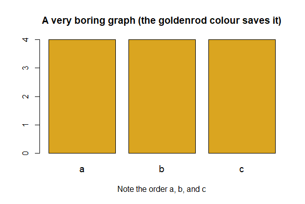
# base R
barplot(table(mydata$A), col = "goldenrod", space = 0.2, cex.names = 1.2,
        main = "A very boring graph (the goldenrod colour saves it)",
        xlab = "Note the order a, b, and c")
# ggplot() way
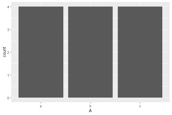
ggplot(mydata, aes(x = A)) +
geom_bar(stat="count")
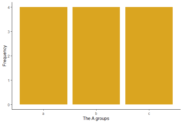
# ggplot() way with more options

ggplot(mydata, aes(x = A)) +
    geom_bar(stat="count", fill = "goldenrod") +
    labs(x = "The A groups", y = "Frequency") +
    theme(text = element_text(size = 15),
      axis.text = element_text(size = 12), aspect.ratio = 0.8) +
    theme_classic()

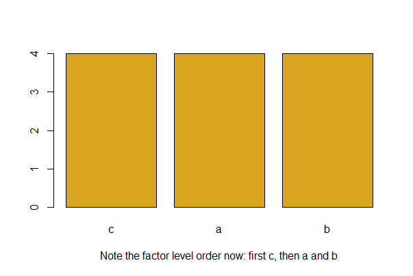
R will arrange the level names of a categorical variable in alphabetical order by default.
Use the factor() functionwith the levels argument to specify a more meaningful order. For example, if the variable A has three groups “a”, “b” and “c”, and you want “c” to come first, use the following and then redraw your barplot.
mydata$A <- factor(mydata$A, levels = c("c","a","b"))

barplot(table(mydata$A), col = "goldenrod",
        xlab = "Note the factor level order now: first c, then a and b")
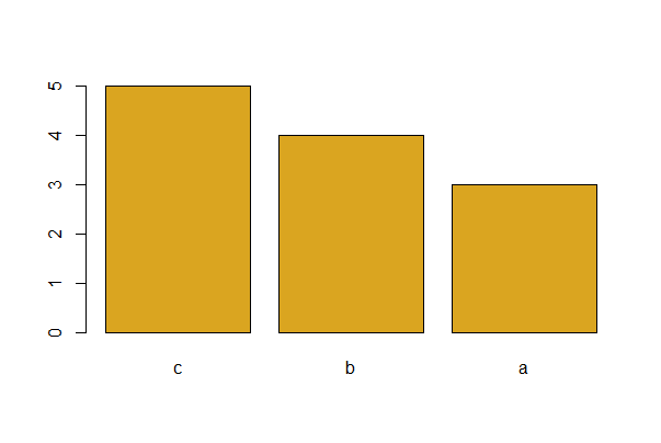
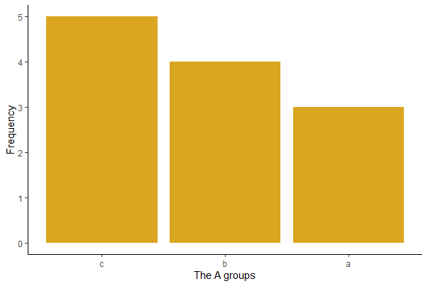
To plot the bars in order of decreasing frequency, (a good idea for bar graphs)
# Let's make new example data with unequal factor level counts for A

# Simulate data
mydata <- data.frame( A = c(rep("a", times = 3),  # a occurs least
                            rep("b", times = 4),
                            rep("c", times = 5)), # c occurs most
                      B = rep(c("m", "f"), times = 6),
                      x = runif(12, -2, 2),
                      y = rnorm(12))

# Using base R
barplot(sort(table(mydata$A), decreasing = TRUE),
        col = "goldenrod", space = 0.2)
# Using ggplot

# Make ordered factor first
mydata$A_ordered <- factor(mydata$A,
    levels = names(sort(table(mydata$A), decreasing = TRUE)) )

ggplot(mydata, aes(x = A_ordered)) +
    geom_bar(stat="count", fill = "goldenrod") +
    labs(x = "The A groups", y = "Frequency") +
    theme(text = element_text(size = 15),
      axis.text = element_text(size = 12), aspect.ratio = 0.8) +
    theme_classic()
If the frequencies are tabulated in a data frame named mytab, then modify as follows. A is a variable in mytab that lists each named category exactly once and Freq is a variable containing the corresponding frequency of cases in each category.
mytab <- summarize(group_by(mydata, A), freq = n())
mytab
# A tibble: 3 x 2
  A      freq
  <chr> <int>
1 a         3
2 b         4
3 c         5
mytab <- arrange(mytab, desc(freq))
mytab
# A tibble: 3 x 2
  A      freq
  <chr> <int>
1 c         5
2 b         4
3 a         3
# Base R way

barplot(mytab$freq, names.arg = mytab$A, col = "goldenrod")

# or

# ggplot() way

mytab$A_ordered <- factor(mytab$A, levels = mytab$A[order(mytab$freq, decreasing = TRUE)] )

ggplot(mytab, aes(x = A_ordered, y = freq)) +
    geom_bar(stat="identity", fill = "firebrick") +
    labs(x = "A group", y = "Frequency") +
    theme(text = element_text(size = 15),
           axis.text = element_text(size = 12), aspect.ratio = 0.8) +
    theme_classic()

## NB these graphs not shown
Histogram
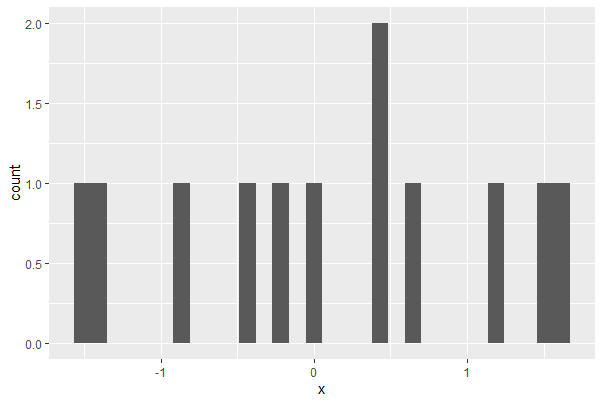
Here, x is a numeric variable in a data frame called mydata. The basic command to make a histogram is:
# Base R

hist(mydata$x, col = "goldenrod")
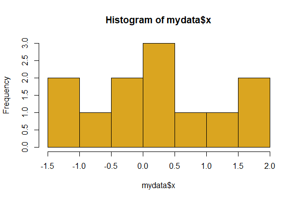
The col argument sets the color of the bars.
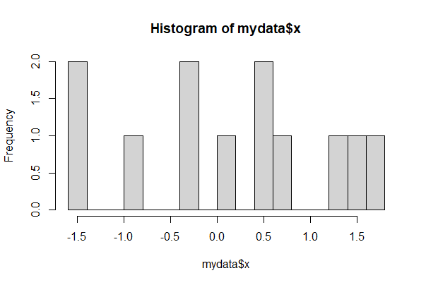
Use the breaks option to influence the width and number of histogram bins. To set the approximate number of bins to 20, use
# Lots more bars with more breaks

hist(mydata$x, breaks = 20)
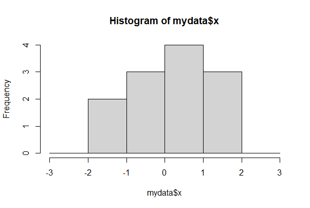
For finer control of bin number and location, specify the breakpoints to be exactly where you want them. For example, the following command creates a series of bins 1 unit wide between the limits 0 and 6.
Make sure all the data fall between your limits or R will complain.
round(mydata$x, 2)
hist(mydata$x, breaks = seq(from=-3, to=3, by=1))
[1] -1.42 -0.38 1.56 0.62 0.00 -1.47 -0.87 0.40 0.43 -0.26 1.66 1.21
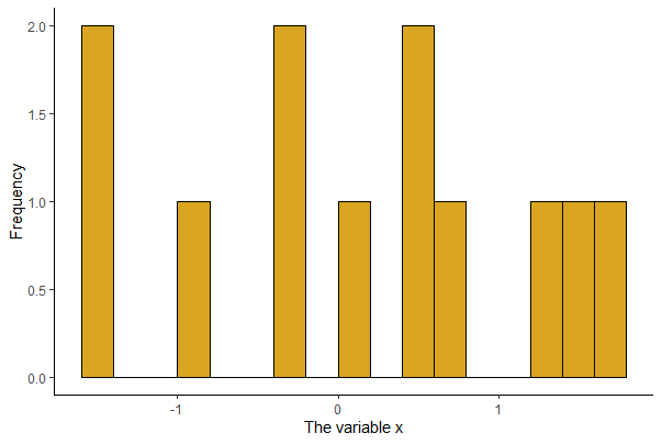
In ggplot, the barest histogram for a numeric variable x in mydata requires only
# Basic ggplot()

ggplot(mydata, aes(x)) + geom_histogram()
The example below improves the graph with a number of options. To see the impact of each option, leave them out and rerun it, adding a new option each time.
# Nicer looking ggplot()
# (but not as easy)

ggplot(mydata, aes(x)) +
    geom_histogram(fill = "goldenrod", col = "black", binwidth = 0.2,
        boundary = 0, closed = "left") +
    labs(x = "The variable x", y = "Frequency") +
    theme(aspect.ratio = 0.80) +
    theme_classic()
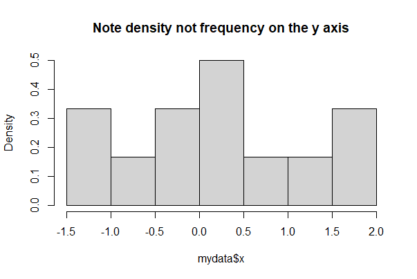
To display probability density instead of raw frequencies, set the argument prob = TRUE
hist(mydata$x, prob = TRUE, right = FALSE,
      main = "Note density not frequency on the y axis")
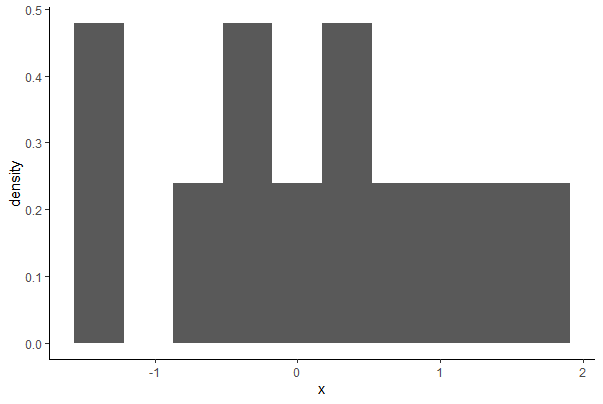
# in ggplot
ggplot(mydata, aes(x)) +
    geom_histogram(aes(y = ..density..),
                   bins = 10) +
    theme_classic()
To superimpose a Gaussian density curve on a histogram, try the following commands. First, some evenly spaced points along the x axis are made between the smallest and largest data value using seq(). We make exactly n = 101 points here - the number of points is arbitrary, but you want enough so that your curve is smooth. Then dnorm() generates the Gaussian density at each x point, using the parameters mean and standard deviation of the data.
# Draw the base histogram
# Note prob = TRUE!
hist(mydata$x, prob = TRUE, right = FALSE)

# Calculate the mean and standard deviation
m <- mean(mydata$x, na.rm = TRUE)
s <- sd(mydata$x, na.rm = TRUE)

# Make a sequence of points based on the range of our data
xpts <- seq(from = min(mydata$x, na.rm=TRUE),
            to = max(mydata$x, na.rm = TRUE), length.out = 101)

# Use dnorm() to create a vector of Gaussian density points
lines(dnorm(xpts, mean=m, sd=s) ~ xpts, col="red", lwd=2)
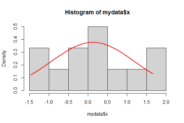
In ggplot, add a stat_function() to get the same,
ggplot(mydata, aes(x)) +
    geom_histogram(aes(y = ..density..), closed = "left", bins = 10) +
    stat_function(fun = dnorm, args = list(mean = mean(mydata$x, na.rm = TRUE),
                sd = sd(mydata$x, na.rm = TRUE))) +
    theme_classic()
Gaussian quantile plot
x is the numeric variable whose distribution is being compared with the Gaussian.
# First make the plot
qqnorm(mydata$x)

# Then add the line
qqline(mydata$x)  # adds line through 1st and 3rd Gaussian quartiles

# We are looking for points that diverge from the theoretical line
# When there are "obvious" differences, it suggests non-Gaussian
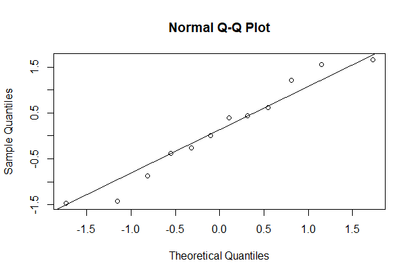
The same can be accomplished in ggplot as follows.
# ggplot2 way
ggplot(mydata, aes(sample = x)) +
    geom_qq() +
    geom_qq_line() +
    theme_classic()

# Graph not shown
3.5 Association between variables
The choice of what graph to make depends on which variables are numeric or categorical. This section shows many basic graph types in R.
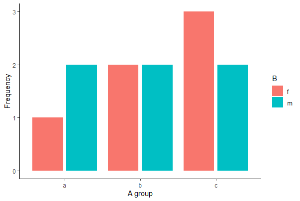
Grouped bar graph
A and B can be factors or character variables in a data frame mydata. The first line of code below is the bare minimum, whereas the second adds a few useful options.
# Your basic Base R grouped barplot

barplot(table(mydata$A, mydata$B), beside = TRUE)
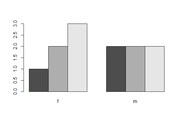
# With rainbow colour omg

barplot(table(mydata$A, mydata$B), beside = TRUE,
    las = 1, col = rainbow(4), cex.names = 0.8, space = c(0.2,0.8),
    xlab = "B group", ylab = "Frequency", legend.text = TRUE)
With ggplot(), use geom_bar(stat=“count”) and the argument position_dodge2(preserve = “single”), which can handle category combinations of A and B having a count of 0.
# ggplot 2 version

ggplot(mydata, aes(x = A, fill = B)) +
    geom_bar(stat = "count", position = position_dodge2(preserve="single")) +
    labs(x = "A group", y = "Frequency") +
    theme(aspect.ratio = 0.80) +
    theme_classic()

# Note the grouping is slightly different than in the previous grouped bar graphs
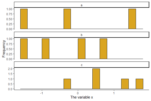
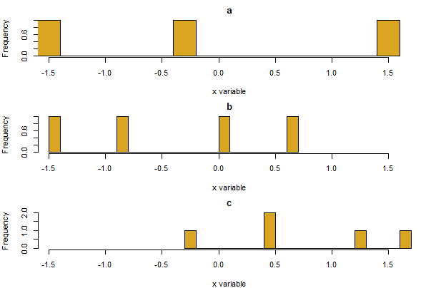
Histograms by group
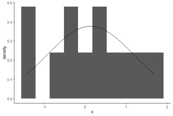
A plot of multiple histograms is useful for comparing the frequency distribution of a numeric variable between groups. Stack the plots above one another if possible, for best results, and use the same minimum and maximum of x-values on the axis. The code below draws a panel of 3 histograms of x, on top of one another, one for each of three groups (a1, a2, a3) of the categorical variable A in mydata.
A panel of plots is accomplished easily with ggplot or the lattice package (a brief introduction to the lattice package is provided at the bottom of this page). In ggplot(), add facet_wrap() to place graphs for different groups on the same page.
# Panel of histograms for each factor level
# Useful for COMPARING a numeric variable BY factor levels

ggplot(mydata, aes(x = x)) +
    geom_histogram(fill = "goldenrod", col = "black", binwidth = 0.2,
        boundary = 0, closed = "left") +
    labs(x = "The variable x", y = "Frequency") +
    theme(aspect.ratio = 0.5) +
    facet_wrap( ~ A, ncol = 1, scales = "free_y") +
    theme_classic()
To accomplish the task in base R, begin by setting up a graphics window with the desired number of rows and columns for your stacked graphs (here, 3 rows and 1 column) using the mfrow argument of the par() function. Here the mar argument is used to adjust the size of the margin around each plot, and cex is used to reduce the font size of labels to make room. The following code loops through the three unique categories of A and draws a histogram for x for each group.
# First set up the arrangement of the graphs
par(mfrow=c(3,1), mar = c(4, 4, 2, 1), cex = 0.7)

# You could make 3 separate graphs here

# a for() loop works too!
for( i in unique(mydata$A) ){
    dat <- subset(mydata, mydata$A == i)
    hist(dat$x, breaks = 20, right = FALSE, xlim = range(mydata$x),
        col="goldenrod", main = i, xlab = "x variable", ylab = "Frequency")
    }

# Often it is useful to remember to reset default parameters
# (restarting R works too...)
par(mfrow=c(1,1), mar = c(5, 4, 4, 2)+.1, cex = 1)
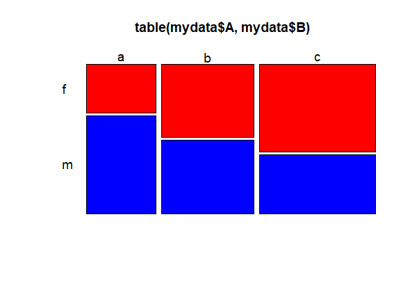
Mosaic plot
We use mosaic plots to look at frequency for 2 categorical variables. A and B can be factors or character variables. color = TRUE yields shades of grey, or a vector of colors can be used instead (shown below for 3 categories). A quick way to get a bunch of different colors is to use color = rainbow(n), where n is the number of categories for the variable B. Other options in the examples below alter the orientation (las) and size (cex.axis) of the labels.
# Base R
mosaicplot(table(mydata$A, mydata$B), color = c("red","blue","yellow"),
           las = 1, cex.axis = 1.2)
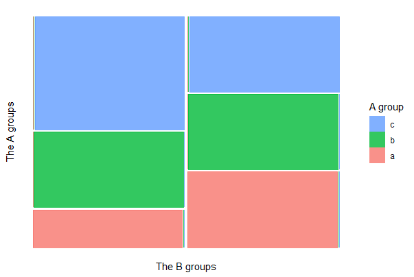
To draw a mosaic plot using ggplot(), first install the {ggmosaic} package. The example below loads the package, assuming it is installed.
library(ggmosaic)

ggplot(mydata) +
    geom_mosaic(aes(x = product(A, B), fill=factor(A))) +
    labs(x = "The B groups", y = "The A groups") +
    theme(aspect.ratio = 1,
          axis.text.x = element_text(angle = -25, hjust= .1, size = 12)) +
    guides(fill = guide_legend(title = "A group", reverse = TRUE)) +
    theme_classic()
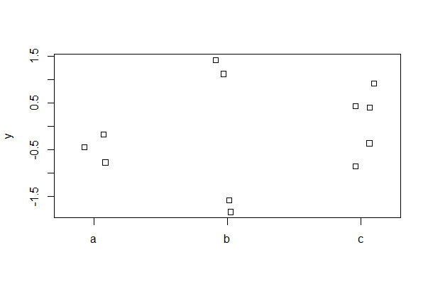
Strip chart
A strip chart (a.k.a a “dot plot”") can be used instead of a box plot when the number of data points is not large. Random noise (“jitter” using the jitter() function) is used to reduce overlap of points. The first example is a basic plot, whereas the second adds common options.
# base R basic stripchart

stripchart(y ~ A, vertical = TRUE, data = mydata, method = "jitter")
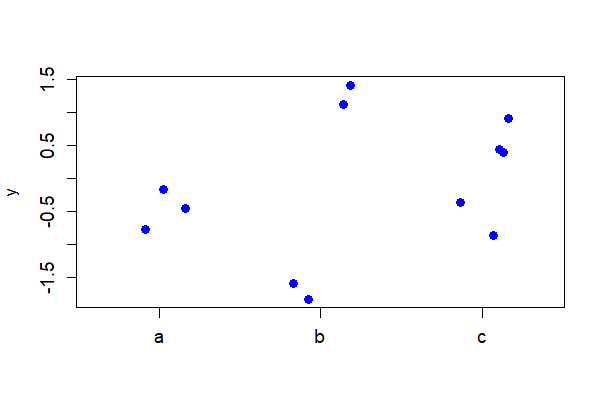
# Base R stricpchart with more options

stripchart(y ~ A, vertical = TRUE, data = mydata, method = "jitter",
    jitter = 0.2, cex.axis = 1.2, cex = 1.2, pch = 16, col = "blue")
The first line of code below shows the basic strip chart with ggplot(). The second example includes common options.
ggplot(mydata, aes(A, y)) + geom_jitter()

ggplot(mydata, aes(A, y)) +
    geom_jitter(color = "blue", size = 3, width = 0.15) +
    labs(x = "A group", y = "y value") +
    theme(aspect.ratio = 0.80, text = element_text(size = 12),
          axis.text = element_text(size = 10)) +
    theme_classic()

# Graphs not shown
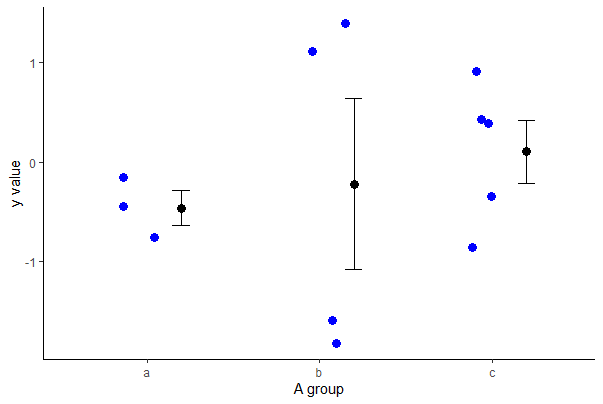
Strip chart with error bars
Use stat_summary() to overlay mean and standard error bars. Use fun.data = mean_cl_normal to get 95% confidence intervals instead of standard error bars. Shift the position of the error bars using position_nudge() to eliminate overlap with the raw data.
# ggplot2 - this requires a bit of code!

ggplot(mydata, aes(A, y)) +
  geom_jitter(color = "blue", size = 3, width = 0.15) +
  stat_summary(fun.data = mean_se, geom = "errorbar",
        width = 0.1, position=position_nudge(x = 0.2)) +
  stat_summary(fun = mean, geom = "point",
        size = 3, position=position_nudge(x = 0.2)) +
  labs(x = "A group", y = "y value") +
  theme(aspect.ratio = 0.80, text = element_text(size = 12),
          axis.text = element_text(size = 10)) +
  theme_classic()
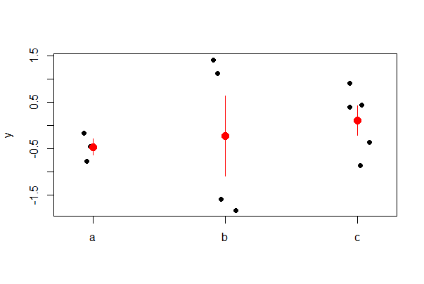
You can add points or lines to a base R stripchart by using integer numbers to indicate position of categories along the x-axis. For example, to add means and standard errors of y to a strip chart for a numeric variable y and a categorical variable A having four categories, use
# Make the base R strip chart
stripchart(y ~ A, data = mydata, vertical = TRUE,
            method = "jitter", pch = 16)

# Make the mean and standard error
m <- tapply(mydata$y, mydata$A, mean, na.rm=TRUE)
se <- tapply(mydata$y, mydata$A,
          function(y){ sd(y, na.rm=TRUE)/sqrt(length(na.omit(y))) })

# Add the means as points
points(m ~ c(1:3), pch = 16, cex = 1.5, col = "red")

# Add the standard errors as segments()
segments(x0 = c(1:3), y0 = m - se,
          x1 = c(1:3), y1 = m + se, col = "red")
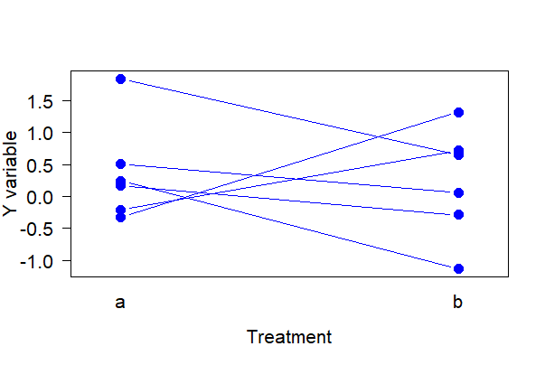
Strip chart for paired data
Paired data should be displayed accordingly. The following commands create a strip chart with lines connection the two measurements of the same unit in the two treatments. The data frame mydata includes the response variable y, the treatment variable A, and an ID variable indicating identity of individuals measured under both treatments.
The following works in base R.
# Simulate some paired data
mydata <- data.frame( A = rep(c("a", "b"), times = 6),
                      id = rep(1:6, each = 2),
                      y = rnorm(12))

# Base R way

interaction.plot(response = mydata$y,
                 x.factor = mydata$A,
                 trace.factor = mydata$id,
                 legend = FALSE, lty = 1,
                 xlab = "Treatment",
                 ylab = "Y variable",
                 type = "b", pch = 16, las = 1, col = "blue",
                 cex = 1.5, cex.lab = 1.3, cex.axis = 1.3)
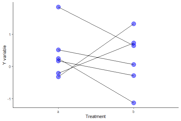
Try the following with ggplot.
# ggplot way

ggplot(mydata, aes(y = y, x = A)) +
    geom_point(size = 5, col = "blue", alpha = 0.5) +
    geom_line(aes(group = id)) +
    labs(x = "Treatment", y = "Y variable") +
    theme(text = element_text(size = 18),
          axis.text = element_text(size = 16), aspect.ratio = 0.80) +
    theme_classic()
Box plot
The following code generates a box plot for the numeric variable y separately for every group identified in the categorical variable A. The following shows use of the formula method in barplot, written as “response_variable ~ explanatory_variable”. Set varwidth = FALSE if you want all boxes to have the same width.
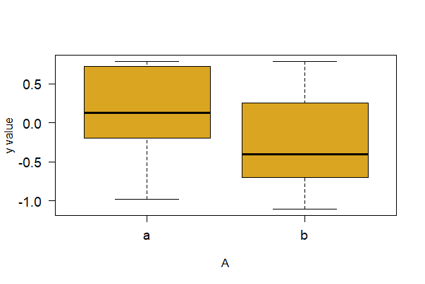
boxplot(formula = y ~ A, data = mydata, varwidth = TRUE,
    ylab="y value", col = "goldenrod", las = 1, cex.axis = 1.2)
The next command shows how to make a basic box plot with ggplot(). Below it is a command with more options. if FALSE (default) make a standard box plot. Set varwidth = TRUE if you want box widths proportional to the square-root of the number of observations in each group.
# Basic ggplot() box plt (not shown)
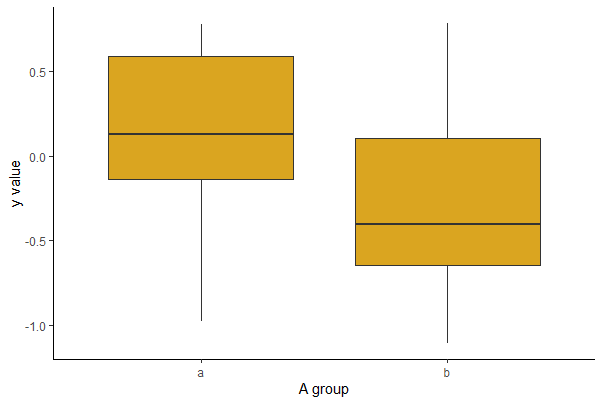
ggplot(mydata, aes(x = A, y = y)) +
geom_boxplot()
# ggplot() box plot with options
ggplot(mydata, aes(x = A, y = y)) +
geom_boxplot(fill = "goldenrod", notch = FALSE, varwidth = TRUE) +
labs(x = "A group", y = "y value") +
theme(text = element_text(size = 15), axis.text = element_text(size = 12),
aspect.ratio = 0.80) +
theme_classic()
Box plots by group
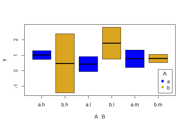
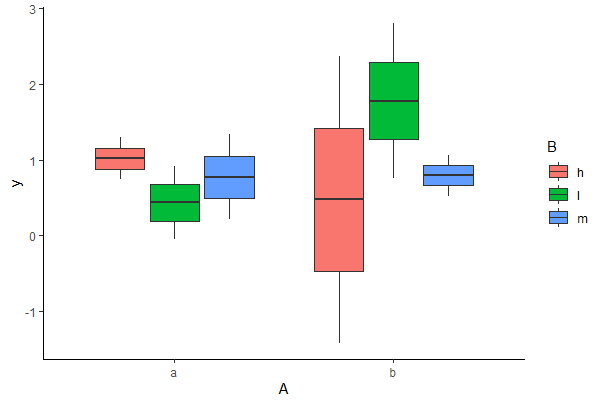
A grouped box plot displays a numeric response variable y for different levels of two categorical variables, A and B. This can be accomplished in base R by overlaying multiple box plots, but it is much easier to produce the plot in ggplot.
# Simulate some data
mydata <- data.frame( A = rep(c("a", "b"), times = 6),
                      B = rep(c("l", "m", "h"), each = 2),
                      y = rnorm(12))

# Basic in Base R
boxplot(y ~ A + B, data = mydata, col = c("blue", "goldenrod"))
legend(x = 6, y = 0.1, legend = c("a", "b"), title = "A",
        pch = c(15, 15), col = c("blue", "goldenrod"))

# We can re-lable the x axis, but have not here
# Grouped boxplot ggplot()
ggplot(data = mydata, aes(x = A, y = y, fill = B)) +
    geom_boxplot()+
    theme_classic()
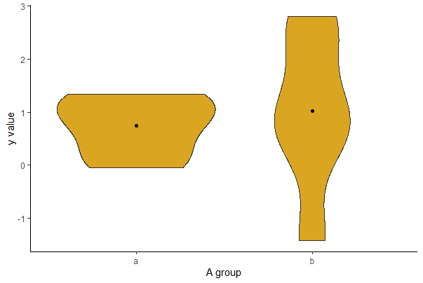
Violin plot
A violin plot shows the frequency distribution for a numerical variable (and its mirror image) for several groups, which is kind of nice. The frequency distribution is a kernel density estimate, which “smooths” the distribution. The following code generates a violin plot for the numeric variable yvar separately for every group identified in the categorical variable A. This is easiest to accomplish in ggplot. The stat_summary layer adds a dot for the mean of each group.
ggplot(mydata, aes(x = A, y = y)) +
    geom_violin(fill = "goldenrod") +
    stat_summary(fun = mean,  geom = "point", color = "black") +
    labs(x = "A group", y = "y value") +
    theme(text = element_text(size = 15), axis.text = element_text(size = 12),
          aspect.ratio = 0.80) +
    theme_classic()
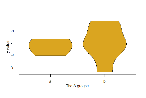
The job is possible without {ggplot2}, but you’ll need to install the {vioplot} package first (or {yarrr}) and then load it. Here, y is the variable plotted separately for groups of the variable A. In this example, A has 2 groups named a, and b. The amount of “smoothing” for the kernel density estimates is controlled by the h option.
library(vioplot)

vioplot(mydata$y[mydata$A == "a"], mydata$y[mydata$A=="b"],
    col="goldenrod", drawRect = FALSE, names = c("a","b"),
    h = 0.8)

mtext("y value", side=2, line=2, las = 3)

mtext("The A groups", side=1, line = 2)
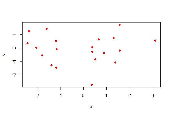
Scatter plot
Here’s how to to produce a scatter plot for two numeric variables, x and y.
# simulate data
mydata <- data.frame(x = rnorm(20),
                     y = rnorm(20))

# formula method, base R
plot(y ~ x, data = mydata, pch = 16, col = rainbow(1))

# Note use of rainbow() for colour...
# basic scatter plot in ggplot (not shown)
ggplot(mydata, aes(x, y)) + geom_point()

# scatter plot with options in ggplot
ggplot(mydata, aes(x, y)) +
    geom_point(size = 4, col = "blue", alpha = 0.5) +
    labs(x = "x variable", y = "y variable") +
    theme(aspect.ratio = 0.80) +
    theme_classic()
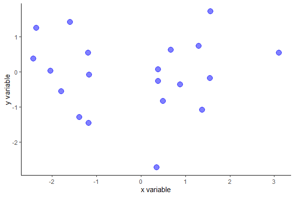
You can probably guess the intent of most of the ggplot() options except alpha, which makes the dots partly transparent.
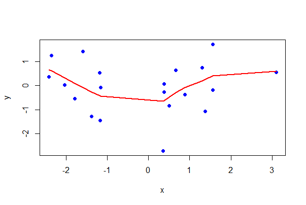
To add a smooth curve through the data, use locally weighted regression. “Local” here means that y is predicted for each x using only data in the vicinity of that x, rather than all the data.
In base R you can control the size of the vicinity using the option f, which is a proportion between 0 (very narrow vicinity) and 1 (uses all the data). Try different values of f to best capture the relationship. The default is f = 2/3.

Note that some features like locally weighted regression lines are powerful, can be pretty, and are easy to make, but are a little like giving a (metaphorical) toddler a shotgun to play with. Use them carefully unless you are sure you know what you are doing.
# Base R with a locally weighted regression line

# Scatterplot
plot(y ~ x, data = mydata,
      pch = 16, col = "blue")

# Add loess() line
lines(lowess(mydata$x, mydata$y, f = 0.5),
lwd = 2, col = "red")
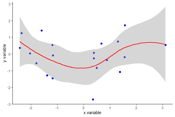
Using ggplot(), you can also get SEs of predicted values with the se argument (set to FALSE if not desired).
ggplot(mydata, aes(x, y)) +
    geom_point(size = 2, col = "blue") +
    labs(x = "x variable", y = "y variable") +
    geom_smooth(method = "loess", size = 1, col = "red", se = TRUE) +
    theme_classic()
To add the least squares regression line to a plot, use the following.
# The Base R way

plot(formula = y ~ x, data = mydata,
      pch = 16, col = "blue")

# Make regression object of plotted formula
z <- lm(y ~ x, data = mydata)

# Add regression line
abline(z, lwd = 2, col = "red")
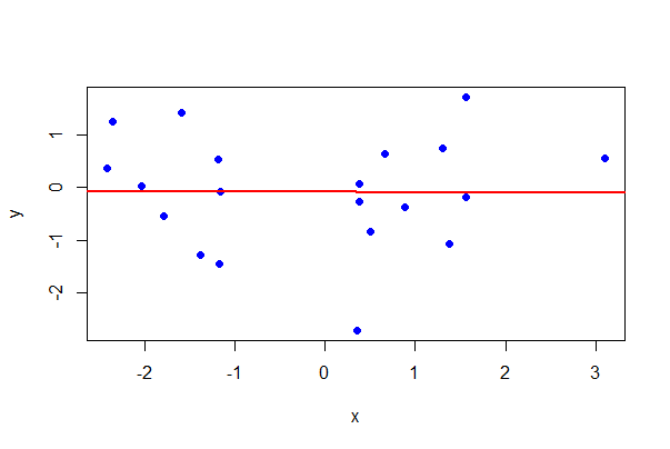
# The ggplot() way

ggplot(mydata, aes(x, y)) +
    geom_point(size = 2, col = "blue") +
    labs(x = "x variable", y = "y variable") +
    geom_smooth(method = "lm", size = 1, col = "red") +
    theme_classic()

# Graph not shown
In base R you can use the cursor to click data points to identify individuals. The following code prints the row number when you click a point (change that by setting the labels option to a character variable that labels the point instead).
# draw the plot
plot(y ~ x, data = mydata)

identify(mydata$x, mydata$y, labels = seq_along(mydata$x))

# After using the identify() function, click on the graph near specific points
# Then click in the console and hit enter
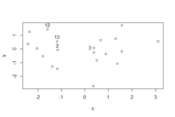
This shows the row number for the indicated points. Very useful!
Scatter plots by group
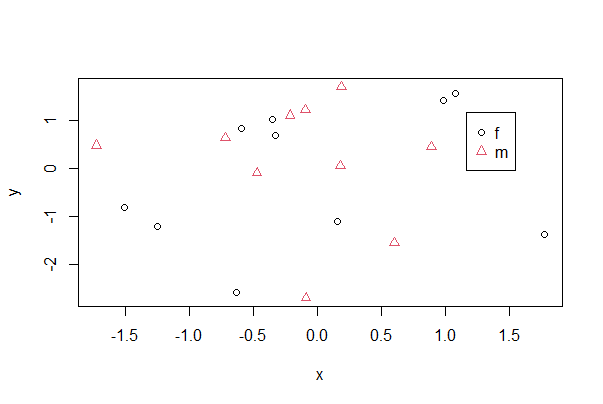
One way to make a scatter plot for multiple groups is to superimpose them all on a single plot but vary the symbols according to group. In base R, use pch to vary the symbol, col to vary the color, and both to vary both at the same time. x and y are numeric variables, whereas A is a categorical variable identifying groups. If A is already a factor you can use just A instead of factor(A) in the commands below. The legend command adds a legend identifying the groups—click on the plot (inside the plot region) with your cursor to place the legend.
# simulate data
mydata <- data.frame(x = rnorm(20),
                     y = rnorm(20),
                     A = rep(c("m", "f"), 10))


plot(formula = y ~ x, data = mydata,
      pch = as.numeric(factor(mydata$A)),
      col = as.numeric(factor(mydata$A)))

# Note use of locator() to place coordinates for legend
legend( locator(1), legend = as.character(levels(factor(mydata$A))),
    pch = 1:length(levels(factor(mydata$A))),
    col = 1:length(levels(factor(mydata$A))) )
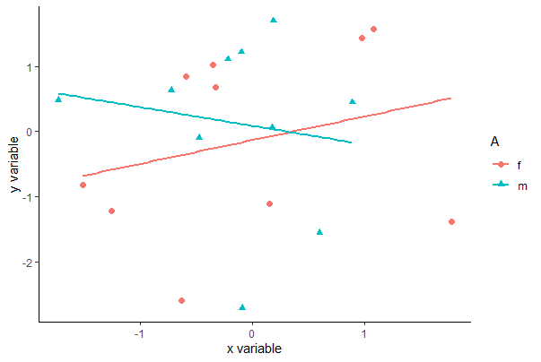
To accomplish the same with ggplot(), specify which variable to vary by color and by shape within aes(), which maps variables to visuals. The example below includes an optional geom_smooth() line that will result in the least squares lines for each group also superimposed.
ggplot(mydata, aes(x, y, colour = A, shape = A)) +
    geom_point(size = 2) +
    geom_smooth(method = "lm", size = 1, se = FALSE) +
    labs(x = "x variable", y = "y variable") +
    theme_classic()
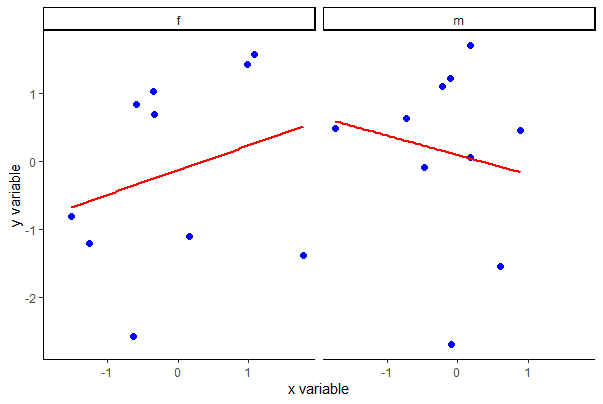
Another way to make a scatter plot for multiple groups is to plot them separately in panes of a panel of plots. Use facet_wrap() in ggplot for this purpose, as follows. The lattice package can also be used to make panels of plots, as described briefly at the bottom of the page.
ggplot(mydata, aes(x, y)) +
    facet_wrap(~A, ncol = 2) +
    geom_point(col = "blue", size = 2) +
    geom_smooth(method = "lm", size = 1, se = FALSE, col = "red") +
    labs(x = "x variable", y = "y variable") +
    theme_classic()
Pairwise scatter plots
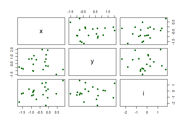
The following command creates a single graph with scatter plots between all pairs of numeric variables in a data frame, mydata. The argument gap adjusts the spacing between separate plots,
# simulate data
mydata <- data.frame(x = rnorm(20),
                     y = rnorm(20),
                     z = rnorm(20),
                     i = rnorm(20))

pairs(mydata, gap = 0.5,
      pch = 16, col = "blue")
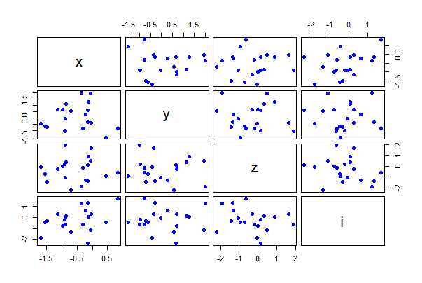
Use the formula method to plot only the three numeric variables x, y, and i in the data frame mydata.
pairs(~ x + y + i, data = mydata,
      pch = 16, col = "darkgreen")
Line plot
Here’s how to plot a sequence of (x, y) points and connect the dots with lines. This is especially useful when the x-variable represents a series of points in time or across a spatial gradient.
A toddler with a shotgun is slightly less hazardous than casually using a line plot when you are not sure you want to show explicit dependency amongst observations
plot(y ~ x, data = mydata, pch=16, col = "blue")

lines(y[order(x)] ~ x[order(x)], data = mydata,
      col = "red")
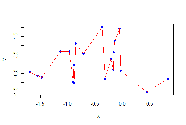
# Eliminate the points, and some options

plot(y[order(x)] ~ x[order(x)], data = mydata, type = "l",
    lty = 3, lwd = 2, col = "red")

# Graph not shown
The basic ggplot command is below. There’s no need to order by x.
# Plain ggplot()
ggplot(data = mydata, aes(x, y)) +
    geom_line()

# Fancier ggplot()
ggplot(data = mydata, aes(x, y)) +
    geom_line(color = "red") +
    geom_point() +
    labs(x = "x variable", y = "y variable") +
    theme(text = element_text(size = 15),
        axis.text = element_text(size = 12), aspect.ratio = 0.75) +
    theme_classic()

# ggplots not shown
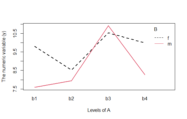
Interaction plots
Interaction plots display how the mean of a numeric response variable y changes between the levels of two categorical variables, A and B. The graph is especially useful for determine whether an interaction is present between two factors A and B in a factorial experiment, or between a factor A and a blocking variable B. If the lines are parallel then there is no interaction.
The function interaction.plot() is quick but rudimentary (it doesn’t show the data).
# simulate data
mydata <- data.frame(y = rnorm(20, 10, 3),
                     A = rep(c("b1", "b2", "b3", "b4"), each = 5),
                     B = rep(c("m", "f"), 10))

interaction.plot(x.factor = mydata$A,
                 trace.factor = mydata$B,
                 response = mydata$y,
                     trace.label = "")
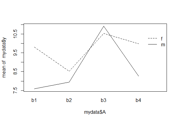
A toddler with a shotgun is slightly less dangerous than a haphazard interaction plot.
You should notice the levels of the variable listed first (here, A) will be displayed along the x-axis of the plot. The y-axis will then display the mean of y separately for each category of the second variable, B. Variations on this command include:
# Put B along x-axis instead (not shown)
interaction.plot(mydata$B, mydata$A, mydata$y)

# Plot the median of y (not shown)
interaction.plot(mydata$A, mydata$B, mydata$y, fun = median)

# More room for A's labels (not shown)
interaction.plot(mydata$A, mydata$B, mydata$y, las=2)

# Color the lines (this one is shown)
interaction.plot(mydata$A, mydata$B, mydata$y,
        col = 1:length(unique(mydata$B)),
        lwd = 2,
        xlab = "Levels of A",
        ylab = "The numeric variable (y)",
        trace.label = "B")
3.6 Using the {lattice} package
The {lattice} package makes it easy to draw a panel of plots separately by group. The basic plot is simple, but commands to add points and lines to the individual panes can be tricky.
The {lattice} package is included with the basic installation but you need to load the library. The graph types available in the {lattice} package include the standard ones found also in R’s basic {graphics} package, such as box plots, histograms, and so on. The table below lists the most types and the relevant command.
For example, to draw a histogram of a numeric variable x separately for four groups identified by the variable B in the data frame mydata, use:
# simulate data
mydata <- data.frame(x = rnorm(20, 10, 3),
                     A = rep(c("m", "f"), 10),
                     B = rep(c("b1", "b2", "b3", "b4"), each = 5))

library(lattice)

histogram(~ x | B, data = mydata, layout = c(1,4))
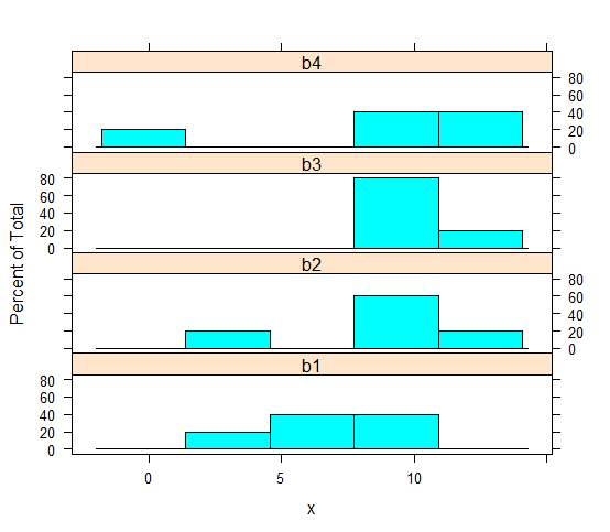
The layout argument is special to {lattice} and draws the 4 panels in a grid with 1 column with 4 rows, so that the histograms are stacked and most easily compared visually.
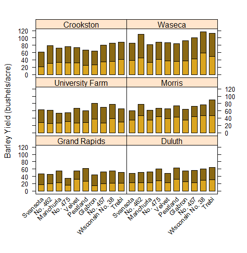
You can make quite powerful graphs that shows relationships across different factor levels. Here is an example from the classic base R dataset barley looking at yield for 2 years across a bunch of different levels of barley variety. Each panel is a different field site.
# Fancy barchart in lattice (code is fairly short and easy)

barchart(yield ~ variety | site, data = barley,
        groups = year, layout = c(2,3), stack = TRUE,
        col=c("goldenrod","goldenrod4"),
        ylab = "Barley Yield (bushels/acre)",
        scales = list(x = list(rot = 45)))
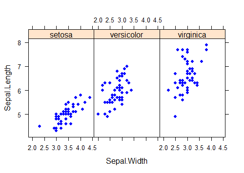
You can do this “by panel” manipulation with lots different plot types too. Let’s draw a scatter plot to show the relationship between the numeric variables Sepal.Length and Sepal.Height separately for each Species using the classic dataset in r "iris". The pch argument in this example replaces the default plot symbol (an open circle) with a filled dot, and the aspect argument sets the relative lengths of the vertical and horizontal axes.
xyplot(Sepal.Length ~ Sepal.Width | Species,
       data = iris,
       pch = 16, aspect = 1.5, col = "blue")
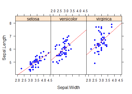
It is possible to add plot elements to individual panels, but the commands and options take some getting used to. For example, to fit a separate regression line to each scatter plot, one to each group, use the panel argument in xyplot to construct a function that applies built-in panel functions to each group, as follows.
xyplot(Sepal.Length ~ Sepal.Width | Species,
       data = iris, aspect = 1.5,
       panel=function(x, y){                # Use x and y here, not real variable names
       panel.xyplot(x, y,                   # draws the scatter plot
                    pch = 16, col = "blue" )
       panel.lmline(x, y,                   # fits the regression line
                    col = "red")
        }
    )
This doesn’t even begin to describe the possibilities using the lattice package. Like a lot of things in life, if you want to get serious about lattice, further study will be required, e.g.:
Crawley, M.J., 2012. The R Book 2ed. Wiley, UK
(good examples on {lattice} and many other topics)
Sarkar, D., 2008. Lattice: Multivariate Data Visualization with R 1ed. 2008. Springer, New York
(a definitive {lattice} reference)
Below are a few commonly used plotting commands in {lattice}. In the syntax, x and y are numeric variables, whereas A and B are categorical variables (character or factor). B is a factor or character variable that will define the groups or subsets of the data frame to be plotted in separate panels. A separate plot in the graphics window will be made for each of the groups defined by the variable B.
Bar graph: barchart() Syntax == barchart(~ table(A) | B, data = mydata)
Box plot bwplot() Syntax == bwplot(x ~ A | B, data = mydata)
Histogram histogram() Syntax == histogram(~ x | B, data = mydata, right=FALSE)
Strip chart stripplot() Syntax == stripplot(x ~ A | B, data = mydata, jitter=TRUE)
Scatter plot xyplot() Syntax == xyplot(y ~ x | B, data = mydata)