Goals
-
Evaluate data using graphical exploration
-
Graph and evaluate frequency distributions
-
Compare frequency distributions
-
Practice good practice in graph design and data exploration
-
Practice {ggplot2} tools and syntax
Get the data for all labs here
Start a script!
For this and every lab or project, begin by starting a new script, create a good header section and table of contents, save the script file with an informative name, and set your working directory. Aim to make the script useful as a future reference for doing things in R - this will come in handy for projects and assessments!
Learning the tools
Displaying data using graphs and tables
The purpose of this lab is to tour the table and graphics capabilities of R, and to explore the best methods for displaying patterns in data. We will do this by exploring some real datasets.
Data set 1: Mammal body mass
These data were published as a data paper in Ecology and deposited in the Ecological Archives (F. A. Smith, S. K. Lyons, S. K. M. Ernest, K. E. Jones, D. M. Kaufman, T. Dayan, P. A. Marquet, J. H. Brown, and J. P. Haskell. 2003. Body mass of late Quaternary mammals. Ecology 84: 3403.)
Most of the variables are categorical, with multiple named categories. “Continent” includes mammals on islands (“Insular” category) whereas “Oceanic” refers to marine mammals. Body mass (in grams) is the sole numeric variable. The “status” variable indicates whether species is currently present in the wild (extant), extinct as of late Pleistocene (extinct), extinct within the last 300 years (historical), or an introduced species (introduction).
Read and examine the data
The data file we will work with is biogeogMammals.csv.
-
Read the contents of the file to a data frame.
-
Use the
head()function to view the first few lines of the data frame on the screen. You’ll see that every row represents the data for a different mammal species.
Frequency tables
- Which continent has the greatest number of mammal species? Which has the least? Make a table (e.g., using
table()) of the frequency of cases on each continent.
2.You’ll notice in the frequency table for the variable “continent” that there’s a typo in the data. One case is shown as having the continent “Af” rather than “AF”. Fix this using the command line in R and recalculate the frequency table.
3.How many extinct mammals are recorded in the data file? Use a frequency table to find out. Create a two-way frequency table (contingency table) showing the status of mammal species on each continent.
4.Judging by eye, which continent has the greatest number of extinctions relative to the number of extant species?
Suggested solutions
All lines below beginning with double hashes are R output
# Load the packages you might need

# Load data
# NB your file path may be different than mine
mammals <- read.csv("data/biogeogMammals.csv")

head(mammals)

##   continent status        order  family      genus       species mass.grams
## 1        AF extant Artiodactyla Bovidae      Addax nasomaculatus    70000.3
## 2        AF extant Artiodactyla Bovidae  Aepyceros      melampus    52500.1
## 3        AF extant Artiodactyla Bovidae Alcelaphus    buselaphus   171001.5
## 4        AF extant Artiodactyla Bovidae Ammodorcas       clarkei    28049.8
## 5        AF extant Artiodactyla Bovidae Ammotragus        lervia    48000.0
## 6        AF extant Artiodactyla Bovidae Antidorcas   marsupialis    39049.9


# Number of mammal species on each continent
table(mammals$continent)

##
##      Af      AF     AUS      EA Insular      NA Oceanic      SA
##       1    1033     346    1033    1484     779      78     977

# Fix "Af"
which(mammals$continent=="Af")

## [1] 322

mammals$continent[322]<-"AF"

table(mammals$continent)

##
##      AF     AUS      EA Insular      NA Oceanic      SA
##    1034     346    1033    1484     779      78     977

# How many extinct mammals?
z <- table(mammals$status)
z

##
##       extant      extinct   historical introduction
##         5388          242           84           17

# The table shows that 242 species of mammal are listed as extinct


# Extinction status by continent (contingency table)
# The table shows that Australia (AUS) has the greatest number of extinct species
#   relative to the total number.
table(mammals$continent, mammals$status)

##
##           extant extinct historical introduction
##   AF        1017      13          4            0
##   AUS        261      45         23           17
##   EA        1027       0          6            0
##   Insular   1405      29         50            0
##   NA         700      78          1            0
##   Oceanic     78       0          0            0
##   SA         900      77          0            0
Graphing frequency distributions
-
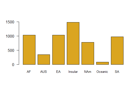
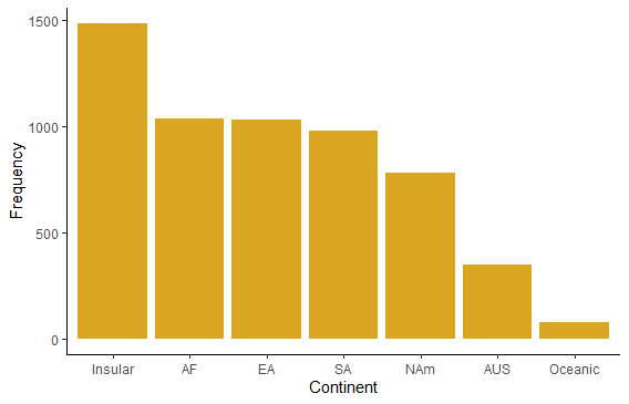
Plot the number of mammal species on each continent using a simple bar graph. Include a label for the y axis.
-
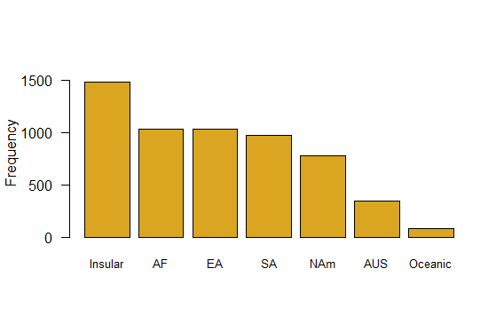
The plot categories are listed in alphabetical order by default, which is arbitrary and makes the visual display less efficient than other possibilities. Redo the bar graph with the continents appearing in order of decreasing numbers of species.
-
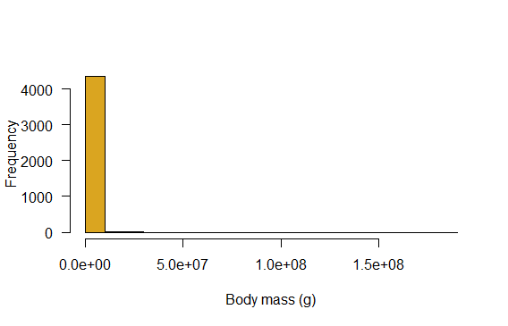
Generate a histogram of the body masses of mammal species. How informative is that?!
-
Create a new variable in the mammal data frame: the log (base 10) of body mass. (See “Transform and add a variable” on the R tips “Data” page if you need help with this.)
-
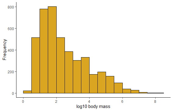
Generate a histogram of log body mass. Is this more informative? Morphological data commonly require a log-transformation to analyze.
-
Redo the previous histogram but use a bin width of 2 units. How much detail is lost?
-
Redo the histogram but try a bin width of of 1; then try 0.5; and then 0.1. Which bin width is superior?
-
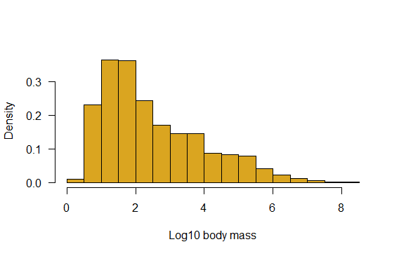
Redo the histogram, but display probability density instead of frequency.
-
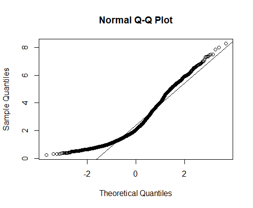
How does the frequency distribution of log body mass depart from a normal distribution? Answer by visual examination of the histogram you just created. Now answer by examining a normal quantile plot instead. Which display is more informative?
-
Optional: redraw the histogram of log body mass and superimpose a normal density curve to assess help detect deviations from normality.
Suggested solutions
# Load the packages you might need
library(ggplot2)

# Bar plot of mammal species by continent
barplot(table(mammals$continent),
        col="goldenrod",
        cex.names=0.8,
        ylim=c(0,1600),
        las = 1)
# Barplot sorted by frequency
barplot(sort(table(mammals$continent),
        decreasing=TRUE),
        col="goldenrod",
        cex.names=0.8,
        las = 1,
        ylim=c(0,1600),
        ylab="Frequency")
# ggplot methods
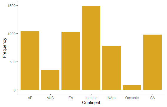
ggplot(mammals, aes(x=continent)) +
geom_bar(stat="count", fill = "goldenrod") +
labs(x = "Continent", y = "Frequency") +
theme_classic()
# To order by category in ggplot, first make a new factor variable

mammals$continent_ordered <- factor(mammals$continent,
                levels = names(sort(table(mammals$continent),
                decreasing = TRUE)) )

ggplot(mammals, aes(x=continent_ordered)) +
    geom_bar(stat="count", fill = "goldenrod") +
    labs(x = "Continent", y = "Frequency") +
  theme_classic()
# Histogram of body masses
hist(mammals$mass.grams, col="goldenrod",
      right = FALSE,
      las = 1,
      xlab = "Body mass (g)",
      main = "")
# Add a new variable, log10 of body mass
mammals$logmass <- log10(mammals$mass.grams)

hist(mammals$logmass,
      col="goldenrod",
      right = FALSE,
      las = 1,
      xlab = "Log10 body mass",
      main = "",
      breaks = seq(0, 8.5, by = 0.5))

Same but using ggplot. You’ll see a Warning: Removed ?? rows containing non-finite values. These are rows with missing data on mass. Use the argument na.rm = TRUE in geom_histogram to get rid of the warning.
ggplot(mammals, aes(x = logmass)) +
    geom_histogram(fill = "goldenrod",
                  col = "black",
                  binwidth = 0.5,
                  boundary = 0) +
    labs(x = "log10 body mass", y = "Frequency") +
    theme_classic()
## Warning: Removed 1372 rows containing non-finite values (stat_bin).
# Results with different bin widths not shown
# Plot density instead
hist(mammals$logmass,
      col="goldenrod",
      right = FALSE,
      las = 1,
      prob = TRUE,
      xlab = "Log10 body mass",
      main = "",
      breaks = seq(0, 8.5, by = 0.5))
# with ggplot
ggplot(mammals, aes(x = logmass)) +
    geom_histogram(fill = "goldenrod",
                  col = "black",
                  binwidth = 0.5,
                  boundary = 0,
                  aes(y = ..density..)) +
    labs(x = "log10 body mass", y = "Density") +
  theme_classic()

## Warning: Removed 1372 rows containing non-finite values (stat_bin).

# Normal quantile plot
qqnorm(mammals$logmass)
qqline(mammals$logmass) # adds the straight line for comparison through 1st and 3rd quartiles
# Histogram with best-fit normal curve superimposed.
# The curve function is fussy about the name of the variable: must be "x"
x <- mammals$logmass
hist(x, col="goldenrod", right = FALSE, las = 1, prob = TRUE,
     xlab = "Log10 body mass", main = "", breaks = seq(0, 8.5, by = 0.5))
m <- mean(x, na.rm = TRUE)
s <- sd(x, na.rm = TRUE)
curve(dnorm(x, mean = m, sd = s), col="blue", lwd = 3, lty = 3, add = TRUE)

Comparing frequency distributions
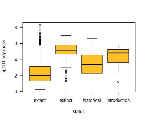
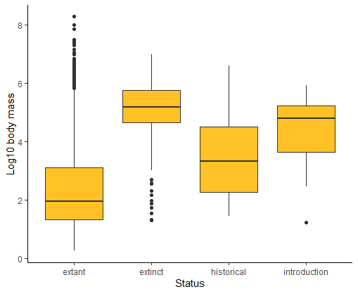
-
Use a box plot to compare the distribution of body sizes (log scale most revealing) of mammals having different extinction status. Are extinct mammals similar to, larger than, or smaller than, extant mammals?
-
Examine the previous box plot. How do the shapes of the body size distributions compare between extinct and extant mammals?
-
Redo the previous box plot but make box width proportional to the square root of sample size. Add a title to the plot.
-
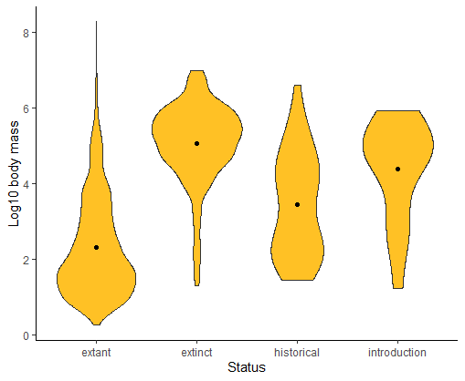
Draw a violin plot to compare the frequency distribution of log body sizes of mammals having different extinction status. Which do you find is more revealing about the shapes of the body size distributions: box plot or violin plot?
-
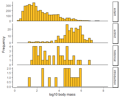
Use multiple histograms to compare the frequency distribution of log body sizes of mammals having different extinction status. Stack the panels one above the other. In this plot, how easy is it to visualize differences among treatments in the distributions compared to your previous plots?
-
Make a table of the median log body mass of each extinction-status group of mammals. Are the values consistent with the plotted distributions?
Suggested solutions
All lines below beginning with double hashes are R output
# Box plot to compare the distribution of body sizes
# Extinct mammals tend to have large mass compared to extant mammals.
# The frequency distributions for these two groups also have opposite skew.

boxplot(logmass ~ status, data = mammals, ylab = "log10 body mass",
        col = "goldenrod1", las = 1)
# or ggplot method
ggplot(mammals, aes(x = status, y = logmass)) +
    geom_boxplot(fill = "goldenrod1", notch = FALSE) +
    labs(x = "Status", y = "Log10 body mass") +
    theme_classic()

## Warning: Removed 1372 rows containing non-finite values (stat_boxplot).
# Violin plot
ggplot(mammals, aes(x = status, y = logmass)) +
    geom_violin(fill = "goldenrod1") +
    labs(x = "Status", y = "Log10 body mass") +
    stat_summary(fun.y = mean,  geom = "point", color = "black") +
  theme_classic()

## Warning: `fun.y` is deprecated. Use `fun` instead.
## Warning: Removed 1372 rows containing non-finite values (stat_ydensity).
## Warning: Removed 1372 rows containing non-finite values (stat_summary).
# Multiple histograms
ggplot(mammals, aes(x = logmass)) +
    geom_histogram(fill = "goldenrod1", col = "black",
             binwidth = 0.2, boundary = 0) +
    labs(x = "log10 body mass", y = "Frequency") +
    facet_wrap(~status, ncol = 1, scales = "free_y", strip.position = "right") +
  theme_classic()

## Warning: Removed 1372 rows containing non-finite values (stat_bin).
Data set 2: Fly sex and longevity
The data are from L. Partridge and M. Farquhar (1981), Sexual activity and the lifespan of male fruitflies, Nature 294: 580-581. The experiment placed male fruit flies with varying numbers of previously-mated or virgin females to investigate how mating activity affects male lifespan. The data are in the file “fruitflies.csv”.
Inspect the data
Open the data file in a spreadsheet program to have a look at it. View the first few lines of the data frame on the screen, and familiarize yourself with the variable names.
Our goal here is to find a plot type that clearly and efficiently visualizes the patterns in the data, especially the differences among groups.
###Analyze
-
Read the data file into a new data frame.
-
Use a strip chart to examine the distribution of longevities in the treatment groups. Try the jitter method to reduce overlap between points. If needed, adjust the size or rotation of the treatment labels so that they all fit on the graph. What pattern of differences between treatments in longevity is revealed?
-
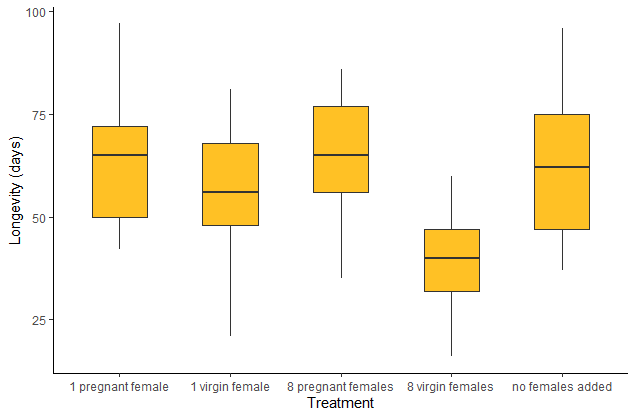
Compare the strip chart to a box plot of the same data. Is the pattern in the data as clear in both types of plot?
-
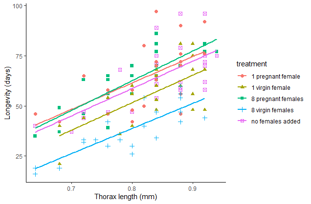
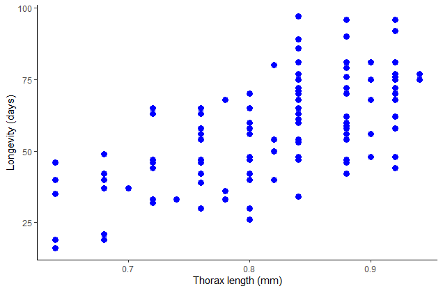
The variable thorax stands for thorax length, which was used as a measure of body size. The measurement was included in case body size also affected longevity. Produce a scatter plot of thorax length and longevity. Make longevity the response variable (i.e., plot it on the vertical axis). Is there a relationship?
-
Redraw the scatter plot but this time use different symbols or colors for the different treatment groups. Add a legend to identify the symbols. Describe the pattern of differences between treatments.
-
Add scatterplot smoothers or linear regressions to the previous figure, one for each group. Do the differences in longevity among the treatments stand out when variation in body size is incorporated?
Answers
All lines below beginning with double hashes are R output
# Read and inspect data
# NB your file path may be different than mine
x <- read.csv("data/fruitflies.csv")

head(x)

##   Npartners          treatment longevity.days thorax.mm
## 1         8 8 pregnant females             35      0.64
## 2         8 8 pregnant females             37      0.68
## 3         8 8 pregnant females             49      0.68
## 4         8 8 pregnant females             46      0.72
## 5         8 8 pregnant females             63      0.72
## 6         8 8 pregnant females             39      0.76

# Strip chart
stripchart(longevity.days ~ treatment,
          data = x,
          vertical = TRUE,
          method = "jitter",
          pch = 16,
          col = "blue",
          cex.axis=0.7,
          ylab="Longevity (days)")
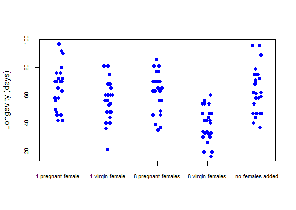
# Strip chart using ggplot
ggplot(x, aes(x=treatment, y=longevity.days)) +
  geom_jitter(color = "blue", size = 3, width = 0.15) +
  labs(x = "Treatment", y = "Longevity (days)") +
  theme_classic()

# Box plot
boxplot(longevity.days ~ treatment, data=x, cex.axis=.7, ylab="Longevity (days)",
      boxwex=0.5, col = "goldenrod1")

# Box plot using ggplot
ggplot(x, aes(x=treatment, y=longevity.days)) +
  geom_boxplot(fill = "goldenrod1", width = 0.5) +
  labs(x = "Treatment", y = "Longevity (days)") +
  theme_classic()
# Scatter plot
plot(longevity.days ~ thorax.mm, data = x, pch = 16, col = "blue", las = 1,
     xlab = "Thorax length (mm)", ylab = "Longevity (days)")

# Scatter plot with ggplot
ggplot(x, aes(x = thorax.mm, y = longevity.days)) +
    geom_point(size = 3, col = "blue") +
    labs(x = "Thorax length (mm)", y = "Longevity (days)") +
    theme_classic()
# Not run - just here to show code

# Scatter plot with separate colors for each group
plot(longevity.days ~ thorax.mm, data=x, pch=as.numeric(factor(treatment)),
        col=as.numeric(factor(treatment)), las = 1,
        xlab = "Thorax length (mm)", ylab = "Longevity (days)")

# NB the locator(1) function allows you to click ON YOUR PLOT
# to place the legend... neat eh?
legend( locator(1), legend = as.character(levels(factor(x$treatment))),
        pch=1:length(levels(factor(x$treatment))),
        col=1:length(levels(factor(x$treatment))) )
# Scatter plot with separate colors for each group using ggplot
ggplot(x, aes(x = thorax.mm, y = longevity.days, colour = treatment,
            shape = treatment)) +
    geom_point(size = 2) +
    labs(x = "Thorax length (mm)", y = "Longevity (days)") +
    theme_classic()

# Add lines; shown for ggplot method only
ggplot(x, aes(x=thorax.mm, y=longevity.days, colour = treatment,
            shape = treatment)) +
    geom_point(size = 2) +
    geom_smooth(method = lm, size = 1, se = FALSE) +
    labs(x = "Thorax length (mm)", y = "Longevity (days)") +
    theme_classic()
## `geom_smooth()` using formula 'y ~ x'